
How We Staged a Home That Felt Cold, And Made It Feel Like Somewhere You’d Never Want to Leave
Not Every Home Starts from a Warm Place
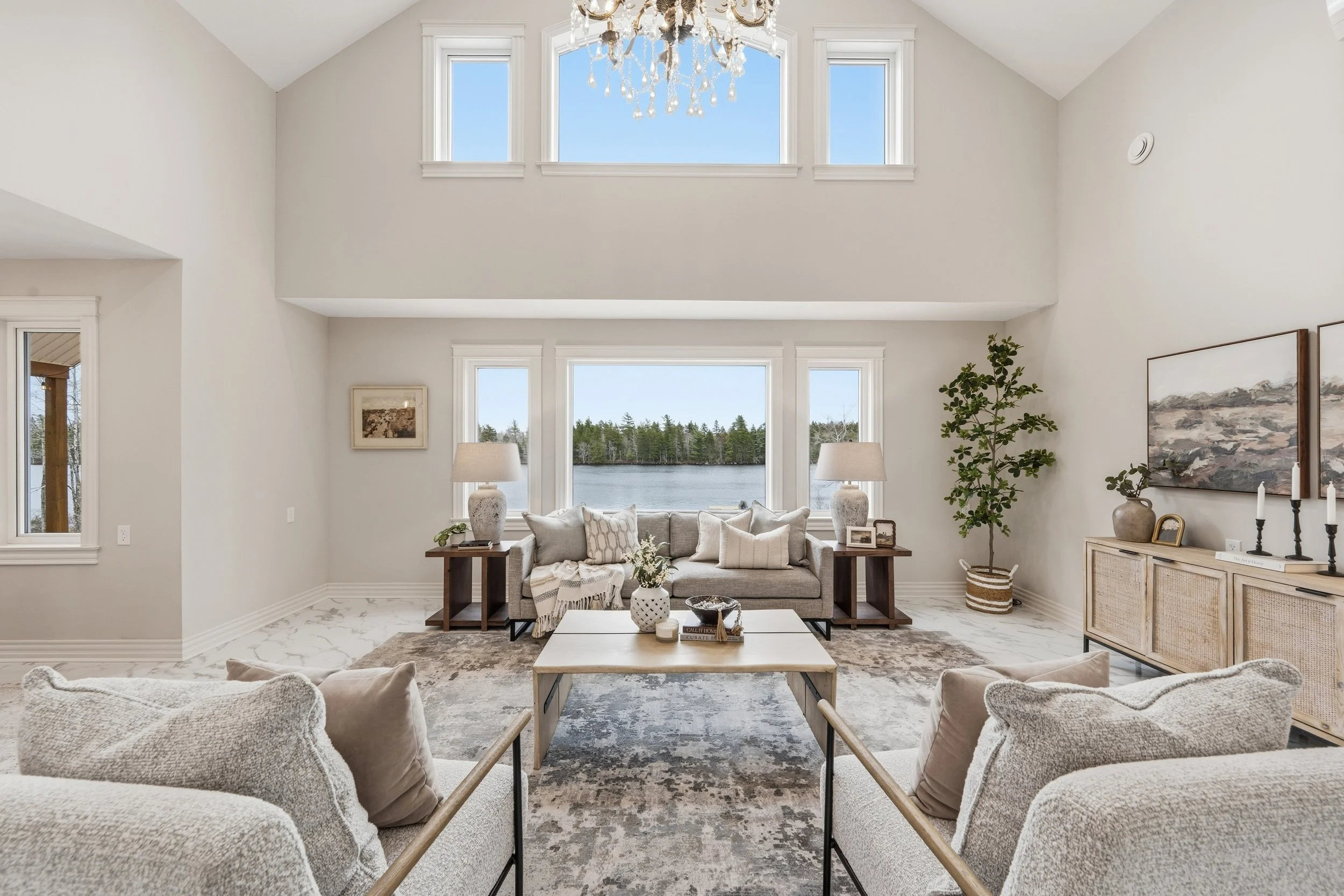
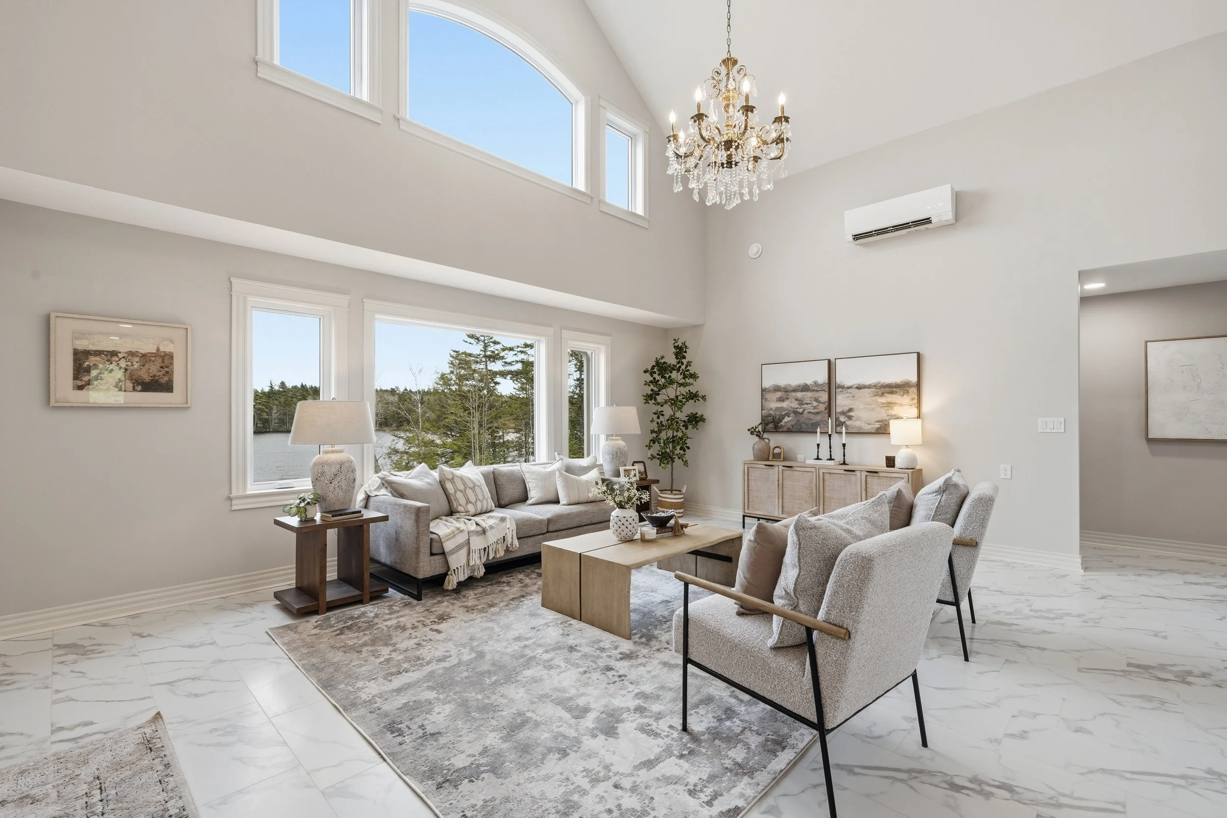
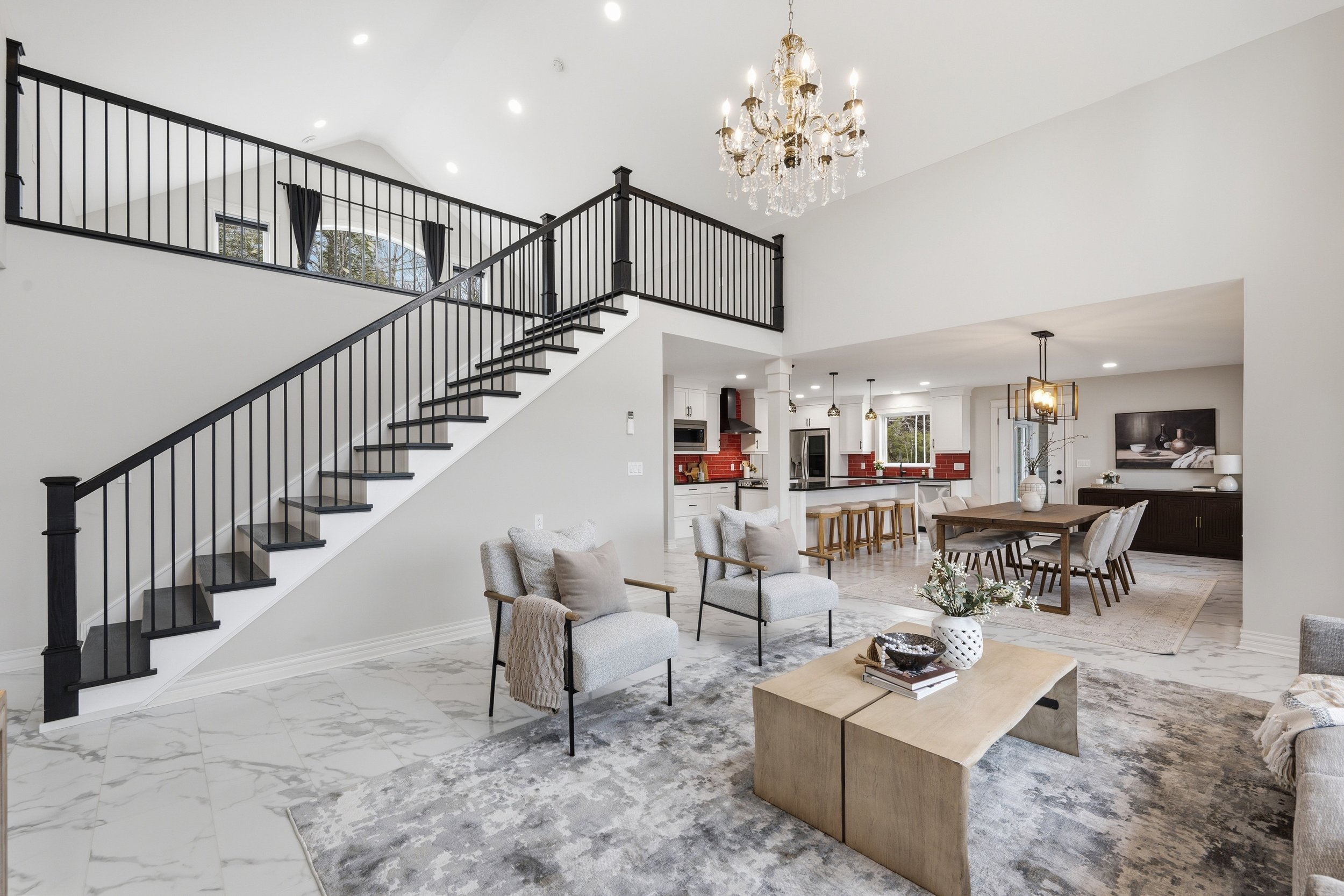
Some homes arrive with all the right bones, great square footage, beautiful finishes, excellent light. And still, when you walk in, something feels off. A quiet coolness. A slight distance between the space and the person standing in it. The light hit the marble beautifully, but without furniture to soften it, the space felt exposed.
That was this one. Grey walls. A marble floor that caught the light beautifully but read cold. A kitchen anchored by bold red tile, the only real pop of colour in the whole home. On paper, it was a striking space. In person, it needed a story.
This is the part of staging that doesn't show up on a checklist.
The Challenge: Working With What the Home Already Had
When our team walked through, the brief was clear almost immediately. This wasn't a home that needed to be redesigned. It needed someone to see what it was trying to be.
The architecture had a cool, clean palette, intentional, architectural, sophisticated. The marble floor was beautiful. The grey walls were calm. But without warmth layered in, the space felt more like a showroom than a home. And buyers don't fall in love with showrooms. They fall in love with places that feel like somewhere they could actually live.
The goal became: respect the home's aesthetic, and bring it to life.
Warmth as a Counterbalance
The first decision was the most important one.
Rather than fighting the cool palette, we leaned into it, and used warmth as a deliberate counterbalance. That meant bringing in fabrics with weight and softness. Layered textiles in earthy, organic tones. Wood finishes that grounded the space and introduced natural warmth without competing with the existing architecture. Rugs were essential here. On a marble floor, a rug doesn't just add comfort, it defines a room. It creates a sense of anchoring, of a space that belongs to someone. Multiple rugs throughout the home helped divide open areas into distinct moments, each with its own atmosphere.
The result was a space that felt quietly rich. The cool bones of the architecture were still visible and respected. But they were now framed by warmth, and that changed everything.
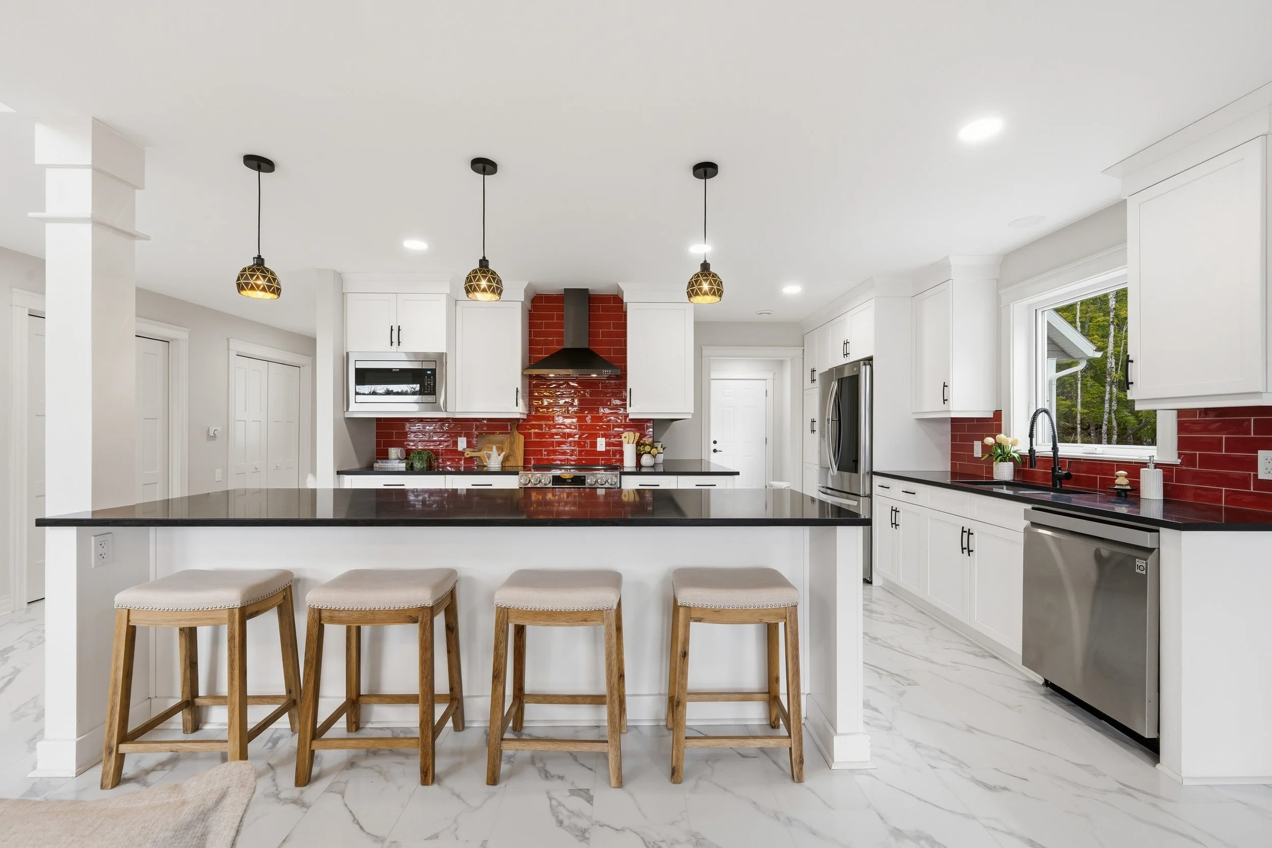
The Red Tile: Working With a Controversial Colour
The kitchen had a beautiful red tile: bold, warm, deeply characterful. And it was the only real colour in the entire home.
Red is a complicated colour in staging. Used carelessly, it can feel aggressive, loud, or difficult to live with. Over-referenced, it becomes the only thing a buyer sees. But ignored entirely, you leave the home's most distinctive feature without support, and it starts to feel like a mismatch. The approach was restraint with intention.
We introduced hints of rust and warm red into the art, just enough to echo the kitchen tile without amplifying it. A little goes a long way. The goal was to acknowledge the red, to make it feel like a design decision rather than a fixture that came with the house, and then quietly step back.
When it worked, the kitchen stopped feeling like a colour problem. It became an asset.
What This Project Teaches About Staging in Challenging Spaces
Every home has something a seller is worried about. A floor they think buyers won't like. A wall colour they regret. A kitchen that doesn't match the rest of the house.
What we've learned, across years of HRM projects, is that the things sellers are most anxious about are almost never dealbreakers for buyers. What matters far more is whether the home feels considered. Whether someone has looked at it clearly, made thoughtful decisions, and created a space that feels cohesive and livable.
A challenging home, staged with intention, almost always reads better than a “neutral” home staged without care. The grey walls and marble floor of this project could have read sterile. Instead, they became the backdrop for a beautifully warm, layered space, one where buyers could see themselves settling in.
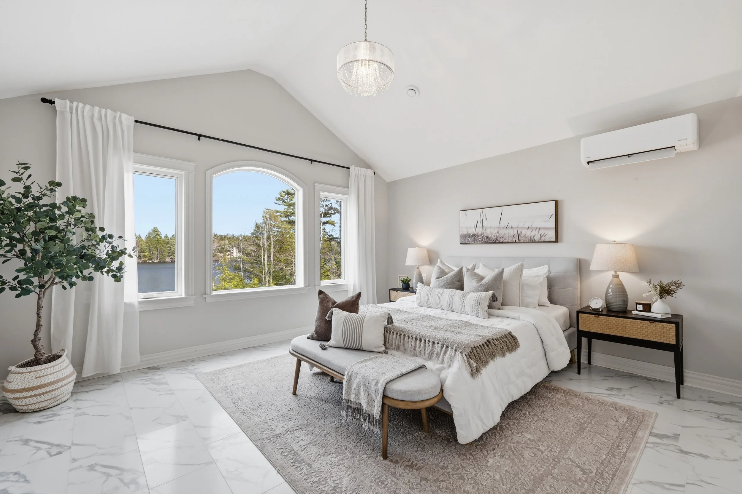
The bedroom is where it all comes together.
Same marble floor, same cool grey palette, and the same approach.
A layered rug to ground it. Soft, weighted textiles on the bed. Warm lamps on either side. A bench at the foot that makes the space feel finished rather than furnished.
The result is a room that feels like rest.